 Why Taylor? Cause she’ll never go out of style, she’ll never go out of style…
Apart from dishing out the catchiest tunes, Taytay is also totally killing it in the music video scene. The recent Bad Blood video got us wishing we’re black leather clad secret agents with kickass codenames! Every one of Taylor’s album shows a very distinctive side of her music and her style: starting from her country roots and moving into her rad pop princessdom. Here at Screed we can’t help but document the evolution of Taylor’s style through room decor inspired by her music videos. In this article, we’ll be dropping tips and tricks all Taylor Swifties must know to recreate the perfect T.S. room. So don’t despair over your dreary room and get teardrops on your guitar! From essential light fixtures, to the right colour scheme, you know we got your back. #SlayTay
GLITTER :: The Chick Flick
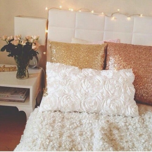
Our Song can easily be the backing track to any Nicholas Sparks flick. It is brimming with elements from every cheesy rom com: the flowers, the romantic front porch, the sneaking out late tapping on your window…With so many conflicting styles in the video, it will be difficult to pull together a room that is cohesive. Hence, we focused on the part that stood out the most: The glittery band sequence where Taylor takes on the character of a glamorous, spunky singer. We’ll be making sparks fly with the help of glitter and also adopting the sunny colour palette from the floral scene which evokes an American Beauty vibe. Note of caution: Avoid adorning large areas with glitter as it usually comes off as cheap and tacky.
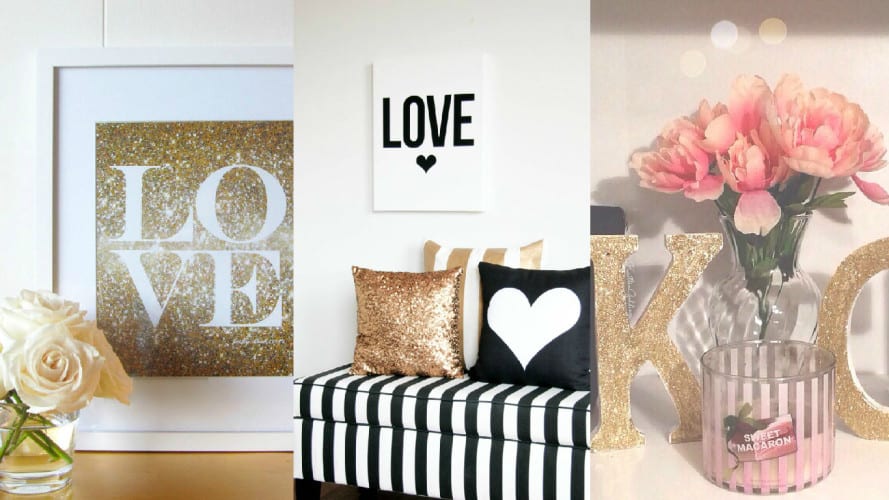
The set up below is the perfect encapsulation of the romantic chick flick bedroom. From the rosette patterned pillow and the vase of dusty roses, to the furry duvet, it is the little details that contribute to creating the ultimate singing-love-songs-in-the-bedroom vibe. For an added tumblr bonus – a frequent online hangout for Ms. Swift – line string lights along your bed. Lining not enough? Check out our string lights article for other ideas!
MIRRORS :: Jane Austen
Love Story is the culmination of every female fantasy in one video. Who doesn’t want to be enchanted by a fairy tale bedroom that they can escape to at the end of the day? Perfect space for the Elizabeth Bennet in us. Unlike the rooms later on this list, this room makes use of warm colours such as yellow, champagne, and gold. Instinctively, gold accents are a must in order to emulate the 18th century grandeur. However, too much gold makes the room dimmer than it is, coupled with warm lights, the resulting effect might become a little underwhelming. That is why we propose using mirrors: they are equally elegant and helps to diffuse the warm tones around the room.
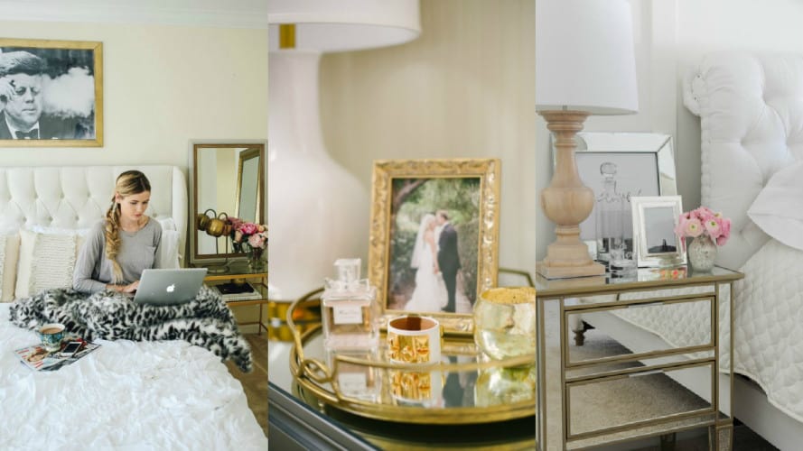
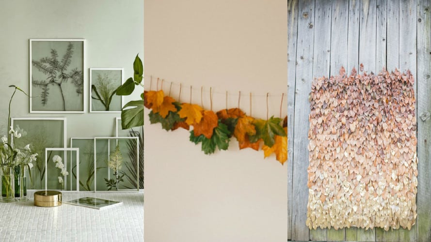
If your room still isn’t enough of a Love Story for you and you’re tempted to sneak out to the garden to see him, don’t! Bring the rendezvous into your room by lightly adorning your room with greenies. Avoid using flowers as adding them into the mix will just overwhelm your room – beauty in simplicity. If you’re not one to add plants into your room, you can still include elements of greens with some plant-related DIYs! Present & Correct, Garland of Grace Blog, and Ruffled Blog shared some amazing DIYs that might interest you. Light up some candles and watch as your room Dr. Whos itself back into the 18th century. Remember to drop a ‘hi’ to Lizzy Bennet on our behalf, we are such fans!
WOOD :: The Scandinavian Spirit
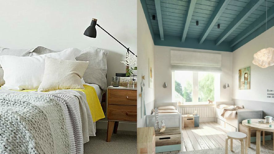
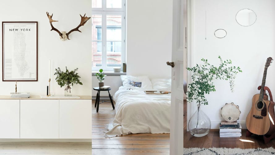
Neutral and muted tones? Check. Furniture with simple silhouettes? Check. Wood? Check. Wide windows with white framing? YES! Ladies and gentlemen, we have a classic example of a Scandinavian inspired room right here. The only thing stopping this Back to December from being truly Scandinavian is that it was filmed in New York and Nashville. How indiscernible right? Almost had us fooled! Now, let’s start fooling your friends (and maybe yourself?) by transforming your room into a Scandinavian wonderland!
The video makes several cuts to landscape scenes exemplifying how wood is essential to the decor. Something very characteristic of Scandinavian design is their sweet love affair with white furniture sporting light wooden accents. Thankfully, most Singaporean floors are lined with parquet which settles the element of wood very quickly. However, if your floors aren’t like that or if you want more wood, you can go for items with a wooden finishing like a guitar! Besides, which Taylor Swift fan doesn’t own a guitar? Cost-friendly ways to add wood to your design would be to incorporate wood decor pieces like picture frames, stools, bedside tables, or lighting fixtures. Including plants into your design is another way to draw attention to the natural quality of your space. We adore how picture on the left uses the stag head to bring in an enhanced woodland atmosphere.
 CONCRETE :: The Industrial Hipster
Don’t be lying on the cold, hard ground when you can’t nail Taytay’s I Knew You Were Trouble (IKYWT) deconstructed style. We’ll be giving you the rundown of how you can create her ‘industrial hipster’ look effortlessly.
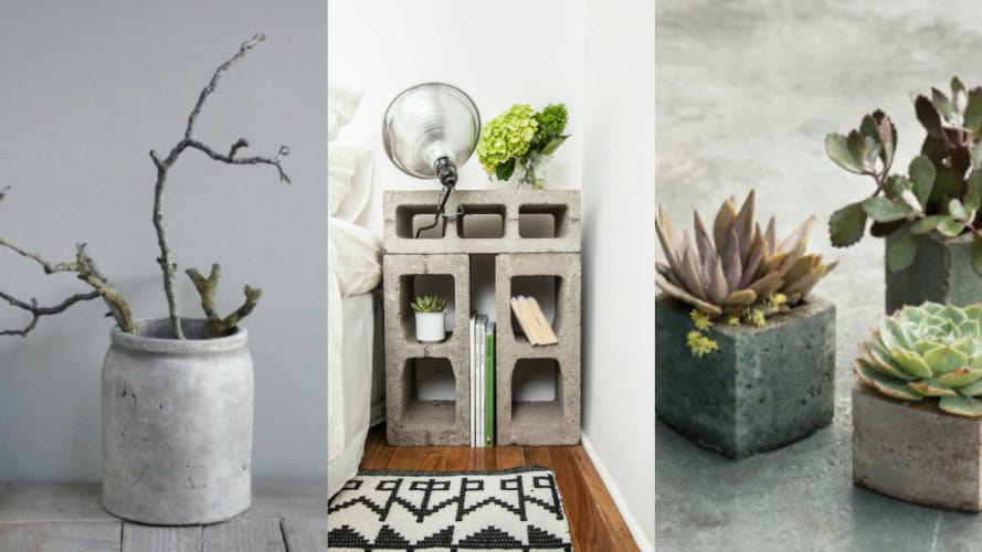
The general sense viewers get from the video is the rawness of deconstructed and naked space. Initially, we wanted metal to be the recurring theme in this room, however, upon closer examination (a.k.a. playing IKYWT on loop!) we noticed that Taylor exudes a “diamond in the rough” character which is not captured in the shiny quality of metals. The verdict: We’ll be playing with concrete! The unfinished quality of the hard, grey concrete gives the room an incomplete but chic look. Easy ways to integrate concrete into your design includes having a bare brick wall. Red brick walls definitely adds a burst of colour to the room which is reminiscent of Taylor’s pink hair tips and monochrome clothes combination.
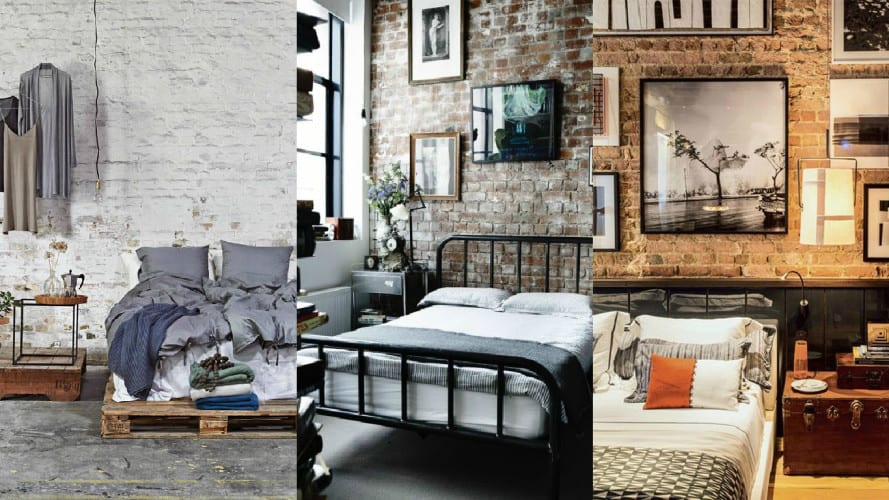
There is a fine line between the Scandinavian and Industrial colour palette, so here’s the trick: The basic way to shift between Scandinavian and Industrial palettes would be to adjust your white to grey ratio. Extrapolating from that point, if adding concrete to your decor is proving to be difficult, go for grey and black furnishing. A tip would be to take into account the texture of the materials: Avoid adding too much sheen to your industrial design.
METALS :: The Modern Seduction
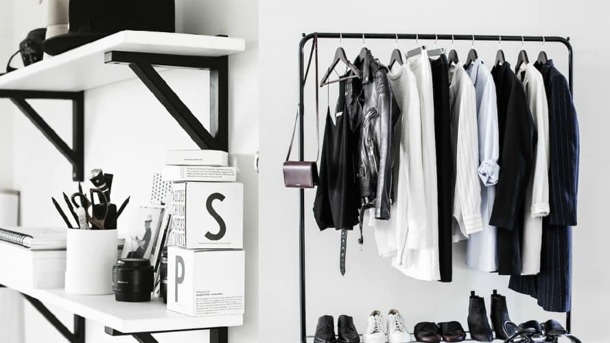
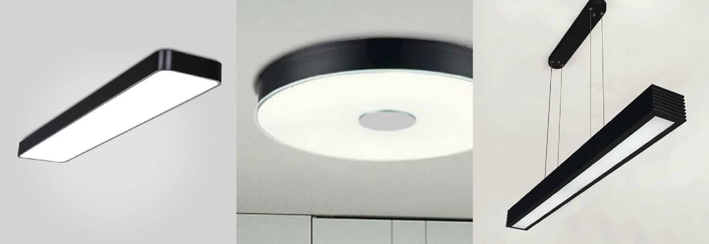
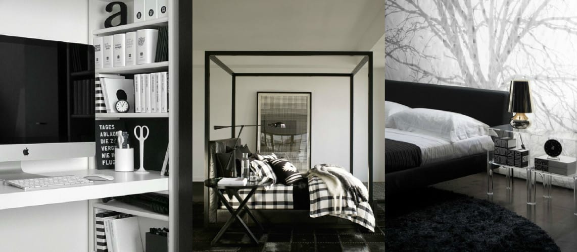
This video really only has three colours – white, black, and red. The Bad Blood video is all about being bold, sleek, and chic at the same time. Hence, the motif we’re adopting for the Bad Blood room is metal. Remember to keep to the colour palette when deciding on the type of metal! Black metals will easily help you achieve your Bad Blood goals. Given its rising popularity, it is not hard to find amazing furniture with black metal finishing. However, if you’re on a tight budget and cannot afford new furniture, don’t despair! You can up-cycle your current furniture with black metal spray paint purchasable from Art Friend. This venture away from conventional silver metals supplies your space with a touch futurism and possesses the potential to resemble Batman’s enclave.
One of the more prominent elements in the video are the bright white lights. It gives the headquarters and the motorcycle race scene a very sleek veneer. Florescent lights are used to give that effect in the video but they are not ideal for the bedroom setting. To switch things up, choose light fixtures that are predominantly white and designed with clean, straight lines. If you’re strictly following the metal motif, you can also go for light fixtures with metallic details. Here are some lighting solutions that we (and perhaps Catastrophe) adore:
In terms of furnishing, we would suggest following the monochrome colour scheme as well as choosing materials with clean edges and polished surfaces. This might come off as boring if it is overdone, therefore a tip is to experiment with different patterns to break the monotony of the monochrome. Bed sheets are a great way to add pattern, they also give you creative freedom as they can be easily switched out for other designs. Look into clear plastics – an idea we got from Taylor’s cutting-edge visor – for interesting storage solutions or to inject a little femininity into a rather masculine style.
Love this article? Comment down below on which artist you would like us to tackle next as well as elements you would like to learn more about! Remember to hit the ‘like’ and ‘share’ button to spread the love.
